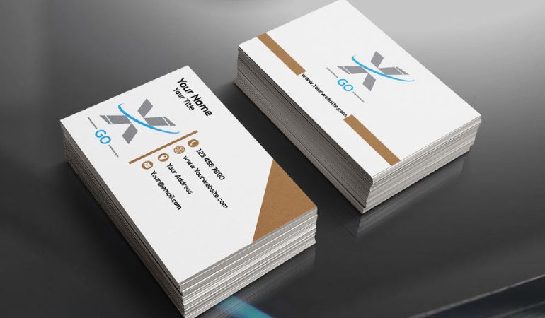
How do you design a good business card?
You have to have business cards for your business. You get to market more that way and people can have it for records. You can’t go without business cards nowadays. It’s important to have business cards that would connect to the readers or potential clients. They should know what you’re all about. They should know what you do and how that can help them. You should also have all necessary contact information on it so they can contact you whenever they want too. It should have phone numbers that they can get in touch with a person instead of a message. It’s a terrible thing if it is for an answering machine. They won’t call back after the first one.
People want a business card with phone numbers, address or email address that they can get in touch with. They don’t want a blank answering machine. The most important thing is for them to contact you and get to talk with someone who can help them directly or else you would miss out on the whole deal.
You can choose a glossy card or a really sturdy one but don’t choose anything that is too much fun because it will look unprofessional. You will also aim for professionalism when making your card. Of course, you want your future clients to take you seriously so anything with stickers or kisses is out of line. Next, you want a light, white, off white, or light blue background, and avoid things like red, yellow, and green, orange, purple because they speak of unprofessionalism. It’s just like designing a website, you don’t want non-standard colors. You want standard colors.
For fonts, you would use big fonts for important things like the name or logo of your business, and standard fonts for contacts information. You want the colors to be dark like black, gray, brown, dark blue or even dark red but not yellow, pink, green, purple or any other funny colors because it looks unprofessional.
Next is the logo of your businesses. You have to have a logo and it has to stand out because it’s a way to market yourself and you want them to remember you. You want to use consistent colors, designs of your logo and nothing different. You want to place them on a visible field so they can see it. You can place them right at the top left, or center, or top right, or bottom left. It’s important that it looks just right and not ridiculously put on.
Next, you want to add the name of your business on the top left in bold, big fonts that they can read, and avoid italics if possible. You should use standards character because anything else could be unprofessional. Next, you want to put catchy headlines about your business so they know what you do. For example, TK computer shop, and then underneath, you will put: we fix computer, repair, remove virus, speed up computers, reformat computers and install parts. You can put as much as five small headlines so they will get a clue of what you’re all about. These are very important because they want to know if you can take care of their needs. If you don’t have them, people won’t know what you do. Here’s your chance to sell yourself to them too. Lastly, you want to add your first and last name, phone numbers, emails, address. When you hand them your cards, make sure that they’re clean cards store in a box somewhere.


