Food Website Design Practices and Top 5 Websites of 2019
Tips and best practices to design a food website
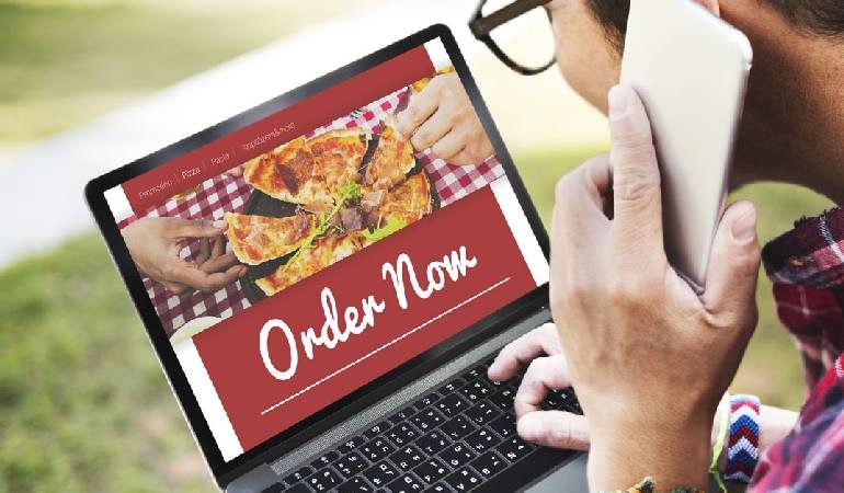
If you have noticed most food or hotel websites, you would find something missing. The visual appeal remains missing in food websites. Though the website would be designed to attract an audience, it does not perform well due to lack of visual appeal. But still, there are certain top food websites which are extremely attractive.
One of the secrets to designing an appealing website is by seeing through the client’s eyes. This way, you can capture the audience attention in a quick time. You need to review the website just like the client does. You have to put yourself in the client’s position and see the website.
While designing a food website, you do not have to show coffee, food or cup. Instead, you can highlight the overall environment, the attractive foods, the conversation, and the ambiance.
It is challenging to showcase the highlights in a single webpage or image. Read through our tips to create the best food websites.
Think from your visitor’s perspective: You need to think who will be visiting the website and why they should visit your website. For example, a coffee shop will be appealing for bloggers and students whereas the pasta shop or family pizza shop showcases a different ambiance.
When developing a website, you need to consider certain points in mind.
- What is available or served in this restaurant? You can add a full menu with attractive images.
- What is the cost of each food? Is there any special food special?
- Where is the hotel located?
- How does the hotel look?
- Can I book for home delivery or table online?
- Is the restaurant child-friendly?
- Is it possible to use Wi-Fi while having lunch?
How to get the contact details of this restaurant?
 Simplicity: Simplicity is the main key for designing a food website. Such websites are very visual. It shares the atmosphere, color, and ambiance of the space. Whenever you are using text, ensure to use as minimum as possible.
It is necessary to give customers complete information they require when providing information. The contents should be in small paragraphs. It should be in simple language and easy to read.
2019’s Top 3 Web Design Sites.
Before going deep on website design tips, let us analyze websites that impress us in a great way. We have rounded some of the top 3 food web design sites that can ignite your creativity.
- NSB Catering: Located in India, Hotel Nellai Saravana Bhava is one of the top caterers in South India. They provide vegetarian catering services to weddings and other joyful occasions.
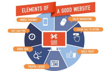
Highlights of the website: The websites impresses with a clear profile and vivid colors. The layout is clean and neat. The website is not cluttered with too many contents but still, it gives all the details that are important for clients. It is simple to scroll and navigate the site. The website loads in quick time. The design conveys professionalism, tradition, and history. In simple words, the website remains as the best example of a simple and clean presentation. It conveys the emotion: I wish to be there!
- EG Wine Co.: It is a canned wine company. The website conveys a lot of information. By just viewing the homepage, you can get a clear idea about the company and the products.
Highlights of the website: The video on the homepage is developed with the theme goals. They show how their product remains suitable for various aspects of life. Be it riding a bike, hiking to the canyon top or relaxing near the fire, the product is best for adventurers of all kinds. It is focused on a particular group. As you scroll the page down, you can see the pairing suggestions. The website gives a casual feel. They have known their audience better. They also know how to market. It is the secret for the success of this website.
- Tick Tock Tea: It is a UK brand that has been selling tea since 1903. The best part of the site is they have used the newest design and utilized the latest trends on their website.
Highlights of the website: The website is complete with eye-catching and attractive colors and images. It automatically customizes as per your time zone. It gives the user a best welcome feel. It not only attracts users but also customers who are turned into fans.

